Saturday 1 August 2009

Memory-Maker (abridged) version 1. London Edition


The construction of autobiography through my practice works around the decision making process, through which I recognize the potential of particular systems that I use to narrate and document my everyday.
Thus, within the idea of collected souvenirs of the ordinary life, I have developed an interest in the archive as a metaphor to reflect the chaotic nature of memory, and also, as a statement of the difficulty and impossibility of carefully recording and classifying the always mutable subject of identity.
By classifying, indexing and labelling “the unimportant”, I have realised that this is a process that builds itself as it keeps unfolding by going back and constantly revising ideas and filling the gaps among the pieces that comprise an archive.
This project is titled Memory-Maker (abridged) version 1. London Edition, based on a site and time specific background (a year as a foreigner in London), an archive in the search of giving significance to memory.
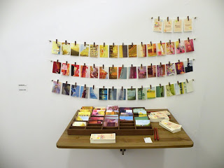
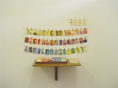
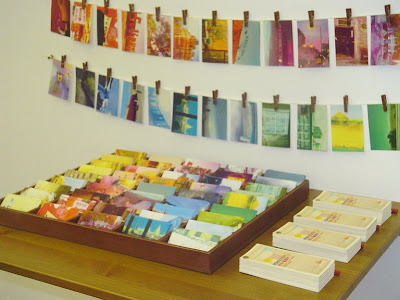
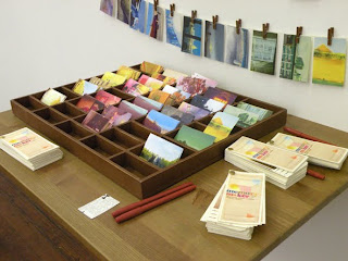
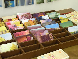
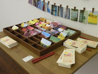
It plays different games between reality and fantasy, in its urgency to hold or conquer the passing of time, exploring the ideas of the imminent disappearance or nothingness within its creation. This archive it’s a book and an installation that consists of three elements (a display on the wall, a box with adhesive copies of 45 images and blank forms bound in four books), a very low-tech system that exists to involve the audience in the process of collecting, organising or classifying my personal memories from 45 weeks of living and studying in London. On the wall, the images are displayed for the audience so they can browse before choosing from the box on the table. Several copies of each of the 45 images are arranged according the colour that dominates the picture, giving a guideline of the possible meanings and stories in the relation colour-emotion. After choosing a sample, the observer is invited to stick the image on a blank form, and then write an adjective, colour and month in order to create a collaborative sample book of shared memories and perceptions.
In this project I wanted to create a collective archive that relied on the making process, in the search for a personal artistic expression that also wants to be universal.
This archive is an experiment that has allowed my personal journals to evolve into a book-object that understands the endless possibilities of the inevitable subjectivity of recording memory within a more public context.

Wednesday 29 July 2009

MEMORY BLOG

This is a memory blog about my MEMORY MAKER (ABRIDGED) DEMO VERSION LONDON EDITION. In here I'll recount all the process behind the project I made for the final degree show of my MA in Book Arts at Camberwell College of Arts. This blog might be helpful for whoever was or is interested in this project and what drew me to develop it.

Monday 1 June 2009

SUGGESTIONS LAYOUT

My project keeps evolving but it feels like a very slow process. In get stuck when I doubt and then I sort of panic. Despite that I think I had a very productive day, I found myself asking why am I doing this and if it's worth keeping all this memories.
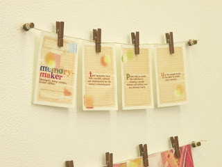
Anyway, today I'm not feeling very sure about having the suggestions or ideas hanging in the wall, which are meant be for people to understand what they have to do with the samples and how they have to put them in the request format.
I started designing the layout and the text is based on the leaflets and samples displays of paintings that I found at the designers shops. The text itself is quite cliche but is what I want to show. I changed some words to give the context of memories-colours relationship.


I also used some of the expressions that can be found to describe things at decoration websites. The first page I designed is meant to explain why the need of this sample book, but although I wanted it to work as the suggestions board that I saw at the designers shop, I was sure I didn't want it too look too "graphic design", like some kind of advertising. I want to keep the idea of the inexpensive, the basic, the simple. I played with the layout and it was hard to find a look since I can't decide how to make it look like a sample book without compromising the design.
Maybe the answer is keeping things simple, regarding the basic sort of aesthetics of the archives.
Simple fonts (typewriter style), labels, old archival paper.

INSPIRATION: Colour samples

Friday 29 May 2009

THINGS TO CONSIDER

  • 10 for each month might not be enough. I think I could make one memory a day (i.e. 30 for september) or even more, since I don't want the box to look weak or empty.
  • I'm just wondering if I need a bit more of text going along with the images. I will have some at the suggestions wall, but I'm wondering what would people think when they complete the sample form.
  • The text of the sample request form needs to be quite clear for the public.
  • Do I want to leave the audience wondering what to do with all the pieces on the table or do I want to be quite clear? Maybe I just need to find the way of balancing that...
  • What do I want to do with all the samples when they're ready? I think I want to create a book out of it so it's important to think about the layout of the sample request form.
  • What would I do afterwards with those books? 1. They can become another project. 2. They can be for sale.
  • Suggestions and sample request forms must be same size if I'm thinking about making them into a book.
  • The stickers are not that easy to peel off so maybe the big blank adhesive sheet doesn't work. Maybe I do need the individual labels.

IN THE MAKING!

I started creating the images for the sample box. I started with the yellow tones since is the colour I chose for September (happy, sort of holiday memories). I'm enjoying the process of going back to those memories and give them a new context, draw on them, think about how they would work as samples. I did 10 in one page because is easier to fit them altogether in order to compare them with each other. Then, I print and cut them in half because when they are complete they look too big (almost 10 x 5.5 cm) and the idea of samples is lost.So I quite like that they look like threads of paper, like paper testers. It also brings up the idea of memory fragmented, the anxiety of putting things together and the impossibility of coming up with one clear picture of a past event.


At this stage I'm regretting not have taken as much pictures as I would have liked. But I have a bad relationship with my camera, I'm hating the poor old thing (even though is still useful) and I desperately want a new one.
About the images itself, I think I prefer the ones I drew more on top. So maybe I need t work more on that. Also need to make the colour contrast more evident between each image. I'm still quite interested in make it all look simple and low cost. But it has to be sleek as well. Is important so stressed the idea of impermanence, of the paradox of how precious we consider memories but also how easy to lose and dispose they are.

Thursday 28 May 2009

WAYS TO TITLE WORK- Cornelia Parker


Thirty Pieces of Silver (exhaled)
Cornelia Parker, 2003
Thirty pieces of plated objects crushed by 250 ton industrial press, metal wire


Talking about how to title our work (always a very difficult thing to do), Sarah recommended me Cornelia Parker's work. Very inspiring.
Found here